Laura Hapka
Review by DeWitt Cheng

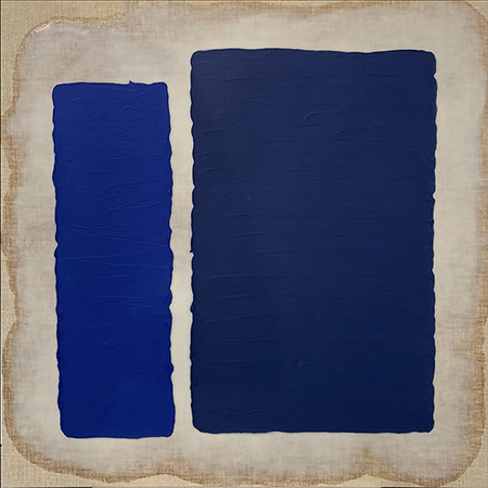
Laura Hapka, “Two Blues,” 2020, acrylic and encaustic on linen panel, 36 x 36”
Continuing through April 24, 2021
The “Primary Process” abstract paintings of Laura Hapka, consisting of pairs of red, blue and yellow rectangles (supplemented by other palettes), hark back to the nonobjective, non-representational paintings of modernism’s golden age. Form was reduced to geometry, and color down to pure primaries, as in the mature works of Piet Mondrian, and Barnett Newman’s response to them in his four “Who’s Afraid of Red, Yellow and Blue” paintings of 1966-70. But if Hapka adopts (at least partially) the pure triadic colors in “Primary Process,” her use of materials, painterly touch and sense of humor (in her allusive, punning titles) counteract the ivory-tower formalism and pomposity satirized by Tom Wolfe in his book “The Painted Word.”
Hapka works on panels covered with linen, which she coats, irregularly, with clear encaustic beeswax, which both emphasizes the weave of the linen and obscures and occludes it where the wax is laid on thicker. On top of this matrix, which suggests fixed manuscripts or scrolls, or linseed oil halations on unprimed canvas, the artist trowels heavy-bodied acrylic paint in parallel stripes, suggestive of writing and icing. The resulting irregularly-shaped Rothkoesque rectangles, framed by the exposed linen, suggest diptychs, or open books, and, more metaphorically, portraits of couples, or the passage of time. When the painted elements are mounted to the wall, as in “The Yellow Press,” or painted directly on it, as in “The Primary Report,” hand-made paper sheets also come to mind. If post-minimalism with its covert anthropomorphism humanized the severe geometry of minimalism, these materials-focused abstractions humanize the impersonal, superflat, machine-look geometric abstractions of the 1960s. Hapka’s color blocks floating in space owe something to Hans Hofmann’s push and pull aesthetic as well.
But if Hapka adopts certain formal limitations and historic antecedents, she also offers resistance to them, if playfully. The nine-diptych, “Red States, Blues States, I Can’t Believe It’s Not Butter,” with its 3x3 array of panels, evinces both her aesthetic rootedness and independence. Hapka moves beyond the primaries into a darker palette of the four “Tone Down” paintings. The color blocks are mismatched — in size, as in “Red Before Red,” and in color, as in “Nostalgic Purple Void.” These are painter’s paintings that embrace art history without being constrained by it. As Ben Shahn once said, “the ancestors are looking benignly over your shoulder; they’re not your enemy.”